5 Common CTA Mistakes DTC Brands Make and How to Fix Them

When designing a landing page, the call-to-action (CTA) is often overlooked, placed behind the product, brand identity, and overall design. However, the CTA should be a top priority in both your pre-click and post-click strategy. A well-crafted CTA can significantly impact your conversion rates, making it essential to give it the attention it deserves.
Here are the top 5 mistakes we see DTC brands make with their CTAs and how to avoid them:

1. Blending the CTA Button with the Background
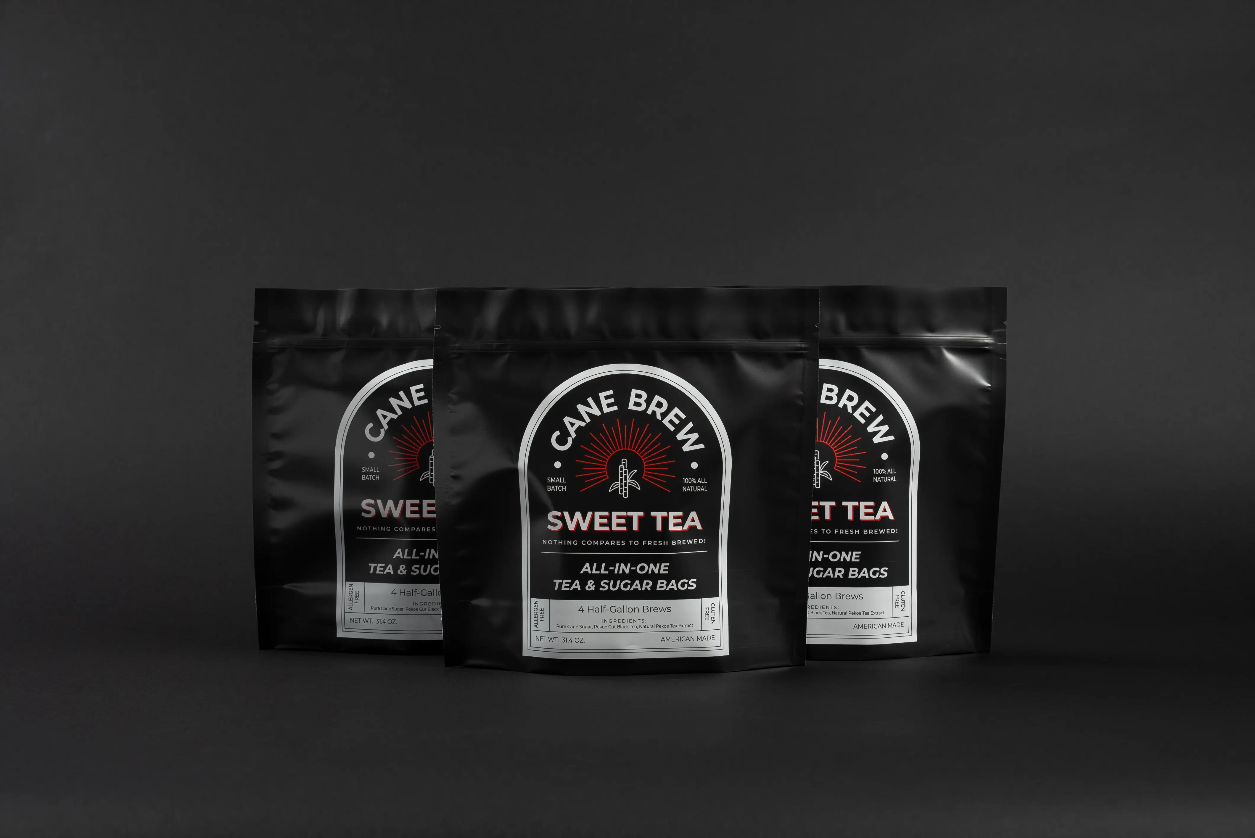
One of the most common mistakes is making the CTA button the same color as the background. This causes the action you want users to take to blend in rather than stand out. The CTA should immediately draw the eye, urging users to take action. A contrasting color that pops off the page will always outperform a subtle, blended button. Which one did your eye go to first?

2. Making Users Work to Find the CTA
In today's fast-paced digital world, users expect convenience. If they have to scroll, click, or search to find your CTA, a significant percentage will bounce off the page. The solution? Simplify the user journey. Implement a sticky header or footer CTA that stays visible as users scroll, ensuring they always have an easy way to take action.

3. Not Split Testing Different CTAs
Assuming that a basic "Buy Now" button will always do the job is a missed opportunity. The most effective CTA can vary greatly depending on your audience. Utilize tools like Meta to split test different phrases such as "Learn More," "Shop Now," "Start Now," and others. Each brand is unique, and finding the right CTA can lead to higher earnings per click.

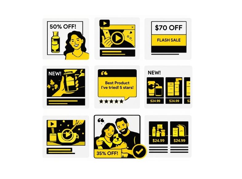
4. Limiting to Just One CTA on the Page
Having only one CTA on a landing page isn't enough, especially in the DTC space where competition for attention is fierce. To maximize conversions, make it as easy as possible for users to engage by including multiple CTAs throughout the page. A button in every section helps guide users smoothly through the journey, increasing the likelihood they'll take the desired action. Remember, too many CTAs is rarely an issue—too few is.

5. Neglecting the Post-Click Experience
The user journey doesn’t end with the click. Where your CTA leads matters just as much. A convoluted post-click flow with too many steps can lead to high bounce rates. Aim to streamline the process—ideally, users should only need 5 to 10 clicks from ad to checkout. The fewer barriers, the better the conversion rate.

Conclusion
Your CTA is the final step in driving user action—making it a critical element of your marketing strategy. By giving it the attention it deserves—through thoughtful design, strategic placement, and continuous testing—you can significantly improve your conversion rates and overall campaign success.


.png)


.webp)


.webp)
_IMG_970x600-1-5.jpg)